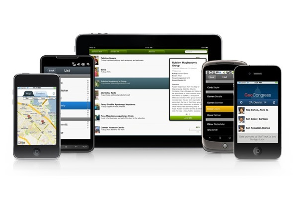
To address the mobile revolution, many companies have created a second mobile version of their website so their content can be viewed on smart phones without a problem. But there are big problems! First, you have to design, maintain, and pay for two separate websites. When you update one, the other is in most cases not automatically updated. Additionally, the mobile site is designed for a specific mobile screen size. If your user does not have that phone model, they will still have to scroll around to see your mobile site version. A better idea—in addition to making your website adaptive—is to redesign your website…and this time design it for mobile first.
When you design for mobile first, you have to re-evaluate all your content. Business owners as well as website designers are still in laptop and desktop design mode. And because they’re thinking in terms of large screens that need to be filled, they put a lot of content online—often way too much. As a result, the vast majority of websites are bloated with way too much information.
It’s time to throw all that non-essential stuff out. The best way to help you make those tough decisions of which content to cut is to think in terms of mobile first. After all, if your main design is optimized for a small screen that adapts by getting bigger when viewed on a laptop screen (as opposed to shrinking when it gets viewed on a smaller screen), it will be easier to take out all the content and graphics that are not really necessary.
If you think that all the content on your current site is necessary, you’re only fooling yourself. Most companies have websites that are way too busy. And while the website may look nice and be “cool” or “trendy,” it’s not getting to the essence of what people need to make decisions or to buy your products. This gives you a strategic reason to get rid of the clutter.
Designing for mobile first forces you to make the hard decisions of what should stay and what should go. It’s similar to when someone moves from a large house to a small condo. When you have the big house, you fill it with a lot of furniture you don’t use, a lot of artwork you don’t look at, and a lot of “must have” gadgets you don’t need. Once you downsize your space, you realize you really don’t need all that stuff. Even though letting go is painful at first, it gradually gets easier once you realize how free and uncluttered you feel.
The same concept applies for your website. You have a big screen to fill, so you fill it. Now put your website on a small screen and decide what your prospects and customers really need to make a buying decision.
Make no mistake: It’s a hard trend (a certainty) that tablets and smart phones are rapidly becoming people’s main computer. Therefore, you want your website to be seen well on these devices and to be useful. If you don’t want the added expense and hassle of two websites, then re-design your current site for mobile first. This simple step will put you light years ahead of your competition and boost your online presence and sales immensely.
Daniel Burrus


Comments